3 Custom Data Visualization Themes
You are reading the free online version of this book. If you’d like to purchase a physical or electronic copy, you can buy it from No Starch Press, Powell’s, Barnes and Noble or Amazon.
A custom theme is nothing more than a chunk of code that applies a set of small tweaks to all plots. So much of the work involved in making a professional chart consists of these kinds of adjustments. What font should you use? Where should the legend go? Should axes have titles? Should charts have grid lines? These questions may seem minor, but they have a major impact on the final product.
In 2018, BBC data journalists Nassos Stylianou and Clara Guibourg, along with their team, developed a custom ggplot theme that matches the BBC’s style. By introducing this bbplot package for others to use, they changed their organization’s culture, removed bottlenecks, and allowed the BBC to visualize data more creatively.
Rather than forcing everyone to copy the long code to tweak each plot they make, custom themes enable everyone who uses them to follow style guidelines and ensure that all data visualizations meet a brand’s standards. For example, to understand the significance of the custom theme introduced at the BBC, it’s helpful to know how things worked before bbplot.
In the mid-2010s, journalists who wanted to make data visualization had two choices:
Use an internal tool that could create data visualizations but was limited to the predefined charts it had been designed to generate.
Use Excel to create mockups and then work with a graphic designer to finalize the charts. This approach led to better results and was much more flexible, but it required extensive, time-consuming back-and-forth with a designer.
Neither of these choices was ideal, and the BBC’s data visualization output was limited. R freed the journalists from having to work with a designer. It wasn’t that the designers were bad (they weren’t), but ggplot allowed the journalists to explore different visualizations on their own. As the team improved their ggplot skills, they realized that it might be possible to produce more than just exploratory data visualizations and to create production-ready charts in R that could go straight onto the BBC website.
This chapter discusses the power of custom ggplot themes, then walks through the code in the bbplot package to demonstrate how custom themes work. You’ll learn how to consolidate your styling code into a reusable function and how to consistently modify your plots’ text, axes, grid lines, background, and other elements.
Styling a Plot with a Custom Theme
The bbplot package has two functions: bbc_style() and finalise_plot(). The latter deals with tasks like adding the BBC logo and saving plots in the correct dimensions. For now, let’s look at the bbc_style() function, which applies a custom ggplot theme to make all the plots look consistent and follow BBC style guidelines.
An Example Plot
To see how this function works, you’ll create a plot showing population data about several penguin species. You’ll be using the palmerpenguins package, which contains data about penguins living on three islands in Antarctica. For a sense of what this data looks like, load the palmerpenguins and tidyverse packages:
Now you have data you can work with in an object called penguins. Here’s what the first 10 rows look like:
# A tibble: 344 × 8
   species island    bill_length_mm bill_depth_mm flipper_length_mm body_mass_g
   <fct>   <fct>              <dbl>         <dbl>             <int>       <int>
 1 Adelie  Torgersen           39.1          18.7               181        3750
 2 Adelie  Torgersen           39.5          17.4               186        3800
 3 Adelie  Torgersen           40.3          18                 195        3250
 4 Adelie  Torgersen           NA            NA                  NA          NA
 5 Adelie  Torgersen           36.7          19.3               193        3450
 6 Adelie  Torgersen           39.3          20.6               190        3650
 7 Adelie  Torgersen           38.9          17.8               181        3625
 8 Adelie  Torgersen           39.2          19.6               195        4675
 9 Adelie  Torgersen           34.1          18.1               193        3475
10 Adelie  Torgersen           42            20.2               190        4250
# ℹ 334 more rows
# ℹ 2 more variables: sex <fct>, year <int>
To get the data in a more usable format, you’ll count how many penguins live on each island with the count() function from the dplyr package (one of several packages that are loaded with the tidyverse):
This gives you some simple data that you can use for plotting:
# A tibble: 3 × 2
  island        n
  <fct>     <int>
1 Biscoe      168
2 Dream       124
3 Torgersen    52
You’ll use this data multiple times in the chapter, so save it as an object called penguins_summary like so:
Now you’re ready to create a plot. Before you see what bbplot does, make a plot with the ggplot defaults:
This code tells R to use the penguins_summary data frame, putting the island on the x-axis and the count of the number of penguins (n) on the y-axis, and making each bar a different color with the fill aesthetic property. Since you’ll modify this plot multiple times, saving it as an object called penguins_plot simplifies the process. Figure 3.1 shows the resulting plot.
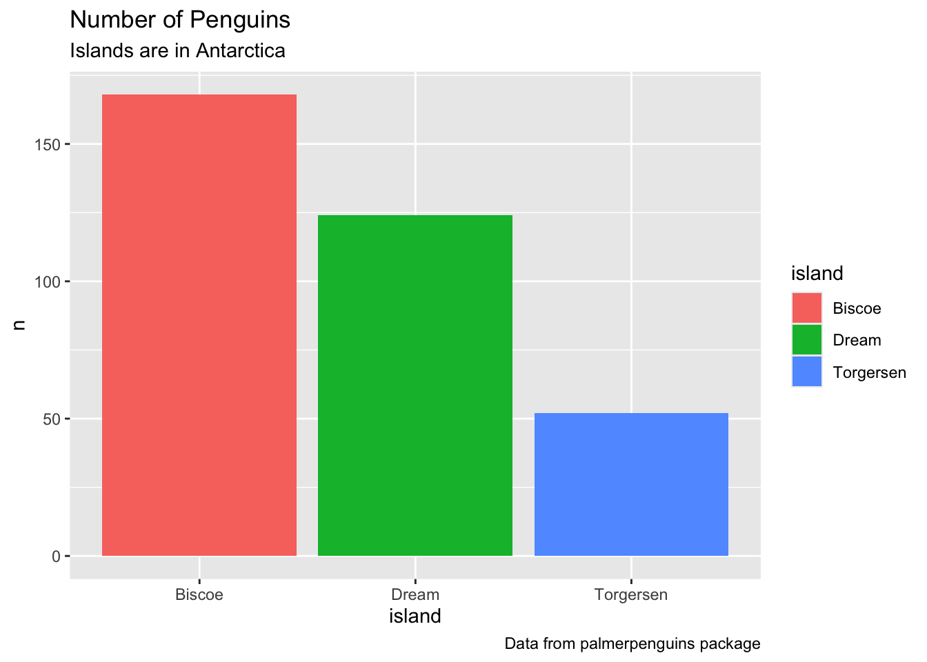
This isn’t the most aesthetically pleasing chart. The gray background is ugly, the y-axis title is hard to read because it’s angled, and the text size overall is quite small. But don’t worry, you’ll be improving it soon.
The BBC’s Custom Theme
Now that you have a basic plot to work with, you’ll start making it look like a BBC chart. To do this, you need to install the bbplot package. First, install the remotes package using install.packages("remotes") so that you can access packages from remote sources. Then, run the following code to install bbplot from the GitHub repository at https://github.com/bbc/bbplot:
library(remotes)
install_github("bbc/bbplot")
Once you’ve installed the bbplot package, load it and apply the bbc_style() function to the penguins_plot as follows:
Figure 3.2 shows the result.

Vastly different, right? The font size is larger, the legend is on top, there are no axis titles, the grid lines are stripped down, and the background is white. Let’s look at these changes one by one.
The BBC Theme Components
You’ve just seen the difference that the bbc_style() function makes to a basic chart. This section walks you through the function’s code, with some minor tweaks for readability. Functions are discussed further in Chapter 12.
Function Definition
The first line gives the function a name and indicates that what follows is, in fact, a function definition:
bbc_style <- function() {
  font <- "Helvetica"

  ggplot2::theme(
The code then defines a variable called font and assigns it the value Helvetica. This allows later sections to simply use font rather than repeating Helvetica multiple times. If the BBC team ever wanted to use a different font, they could change Helvetica here to, say, Comic Sans and it would update the font for all of the BBC plots (though I suspect higher-ups at the BBC might not be on board with that choice).
Historically, working with custom fonts in R was notoriously tricky, but recent changes have made the process much simpler. To ensure that custom fonts such as Helvetica work in ggplot, first install the systemfonts and ragg packages by running this code in the console:
install.packages(c("systemfonts", "ragg"))The systemfonts package allows R to directly access fonts you’ve installed on your computer, and ragg allows ggplot to use those fonts when generating plots.
Next, select Tools > Global Options from RStudio’s main menu bar. Click the Graphics menu at the top of the interface and, under the Backend option, select AGG. This change should ensure that RStudio renders the previews of any plots with the ragg package. With these changes in place, you should be able to use any fonts you’d like (assuming you have them installed) in the same way that the bbc_style() function uses Helvetica.
After specifying the font to use, the code calls ggplot’s theme() function. Rather than first loading ggplot with library(ggplot2) and then calling its theme() function, the ggplot2::theme() syntax indicates in one step that the theme() function comes from the ggplot2 package. You’ll write code in this way when making an R package in Chapter 12.
Nearly all of the code in bbc_style() exists within this theme() function. Remember from Chapter 2 that theme() makes additional tweaks to an existing theme; it isn’t a complete theme like theme_light(), which will change the whole look and feel of your plot. In other words, by jumping straight into the theme() function, bbc_style() makes adjustments to the ggplot defaults. As you’ll see, the bbc_style() function does a lot of tweaking.
Text
The first code section within the theme() function formats the text:
plot.title = ggplot2::element_text(
  family = font,
  size = 28,
  face = "bold",
  color = "#222222"
),
plot.subtitle = ggplot2::element_text(
  family = font,
  size = 22,
  margin = ggplot2::margin(9, 0, 9, 0)
),
plot.caption = ggplot2::element_blank(),
To make changes to the title, subtitle, and caption, it follows this pattern:
AREA_OF_CHART = ELEMENT_TYPE(
  PROPERTY = VALUE
)
For each area, this code specifies the element type: element_text(), element_line(), element_rect(), or element_blank(). Within the element type is where you assign values to properties—for example, setting the font family (the property) to Helvetica (the value). The bbc_style() function uses the various element_ functions to make tweaks, as you’ll see later in this chapter.
One of the main adjustments the bbc_style() function makes is bumping up the font size to help with legibility, especially when plots made with the bbplot package are viewed on smaller mobile devices. The code first formats the title (with plot.title) using Helvetica 28-point bold font in a nearly black color (the hex code #222222). The subtitle (plot.subtitle) is 22-point Helvetica.
The bbc_style() code also adds some spacing between the title and subtitle with the margin() function, specifying the value in points for the top (9), right (0), bottom (9), and left (0) sides. Finally, the element_blank() function removes the default caption (set through the caption argument in the labs() function), “Data from palmer penguins package.” (As mentioned earlier, the finalise_plot() function in the bbplot package adds elements, including an updated caption and the BBC logo, to the bottom of the plots.)
Figure 3.3 shows these changes.
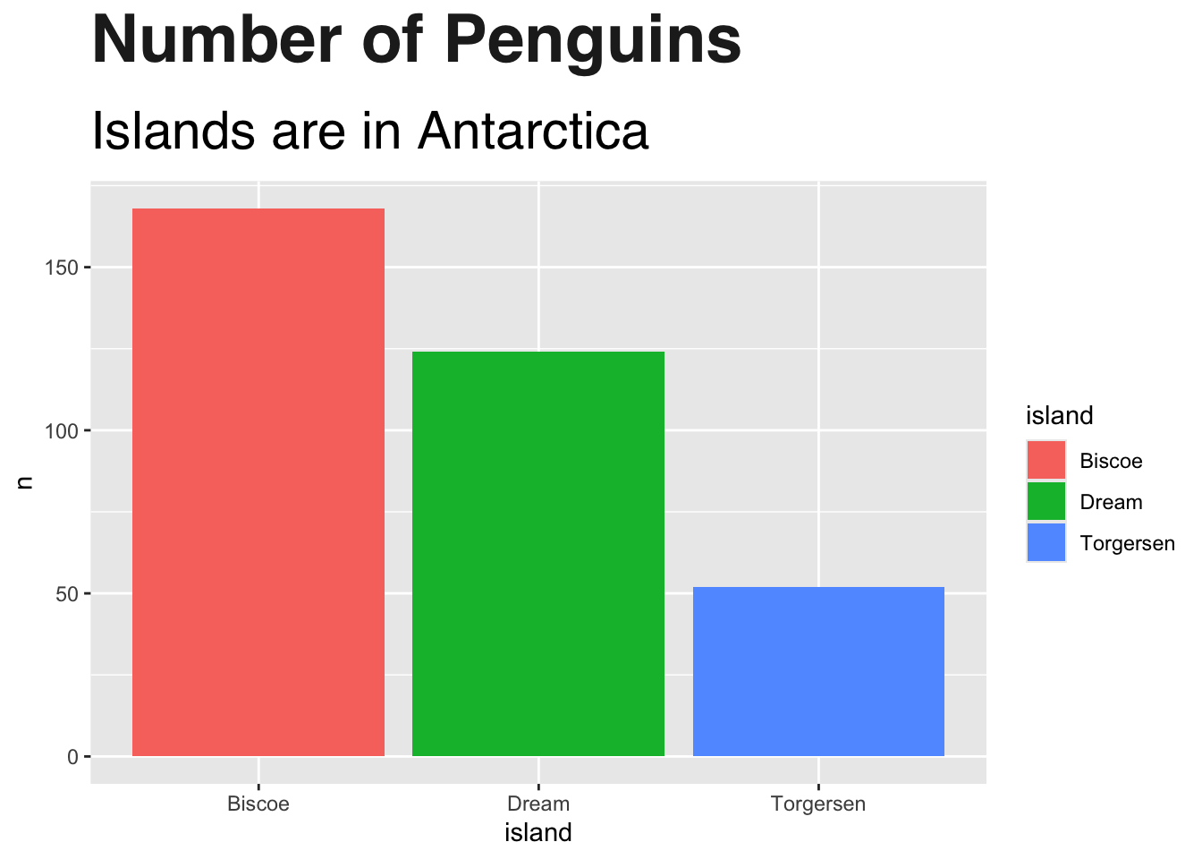
With these changes in place, you’re on your way to the BBC look.
Legend
Next up is formatting the legend, positioning it above the plot and leftaligning its text:
legend.position = "top",
legend.text.align = 0,
legend.background = element_blank(),
legend.title = element_blank(),
legend.key = element_blank(),
legend.text = element_text(
  family = font,
  size = 18,
  color = "#222222"
),
This code removes the legend background (which would show up only if the background color of the entire plot weren’t white), the title, and the legend key (the borders on the boxes that show the island names, just barely visible in Figure 3.3). Finally, the code sets the legend’s text to 18-point Helvetica with the same nearly black color. Figure 3.4 shows the result.
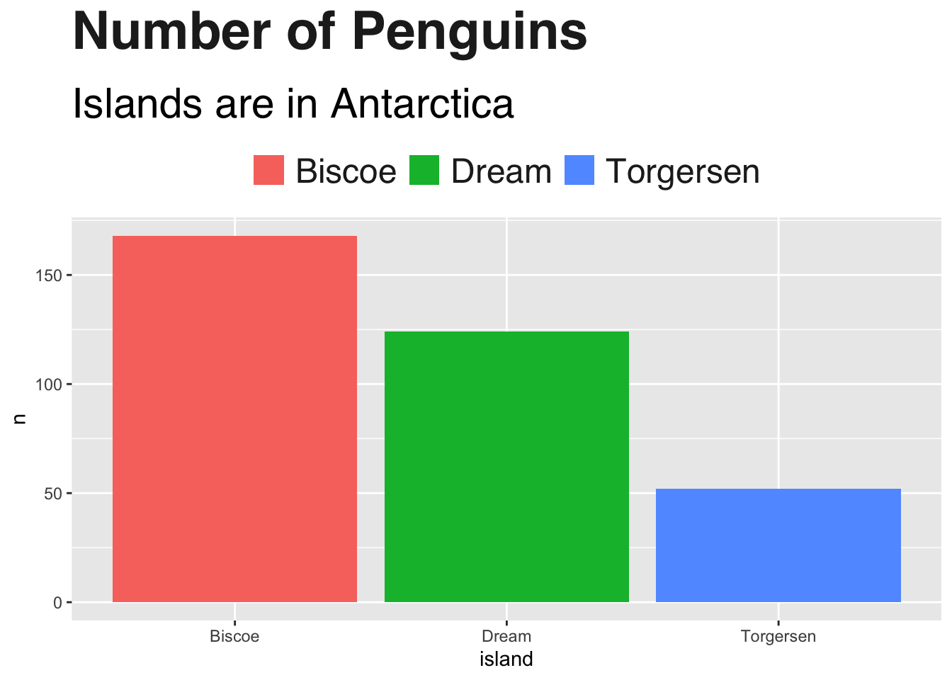
The legend is looking better, but now it’s time to format the rest of the chart so it matches.
Axes
The code first removes the axis titles because they tend to take up a lot of chart real estate, and you can use the title and subtitle to clarify what the axes show:
axis.title = ggplot2::element_blank(),
axis.text = ggplot2::element_text(
  family = font,
  size = 18,
  color = "#222222"
),
axis.text.x = ggplot2::element_text(margin = ggplot2::margin(5, b = 10)),
axis.ticks = ggplot2::element_blank(),
axis.line = ggplot2::element_blank(),
All text on the axes becomes 18-point Helvetica and nearly black. The text on the x-axis (Biscoe, Dream, and Torgersen) gets a bit of spacing around it. Finally, both axes’ ticks and lines are removed. Figure 3.5 shows these changes, although the removal of the axis lines doesn’t make a difference to the display here.
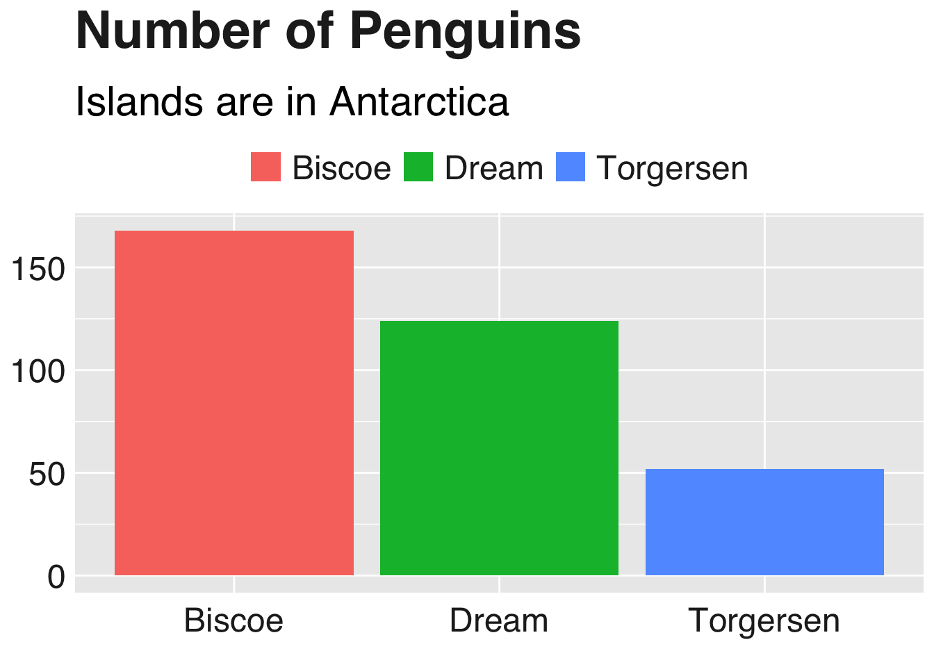
The axis text matches the legend text, and the axis tick marks and lines are gone.
Grid Lines
Now for the grid lines:
panel.grid.minor = ggplot2::element_blank(),
panel.grid.major.y = ggplot2::element_line(color = "#cbcbcb"),
panel.grid.major.x = ggplot2::element_blank(),
The approach here is fairly straightforward: this code removes minor grid lines for both axes, removes major grid lines on the x-axis, and keeps major grid lines on the y-axis but makes them a light gray (the #cbcbcb hex code). Figure 3.6 shows the result.

Background
The previous iteration of our plot still had a gray background. The bbc_style() function removes this with the following code.
panel.background = ggplot2::element_blank(),The plot without the gray background is seen in Figure @ref(fig:penguins-plot-no-bg).
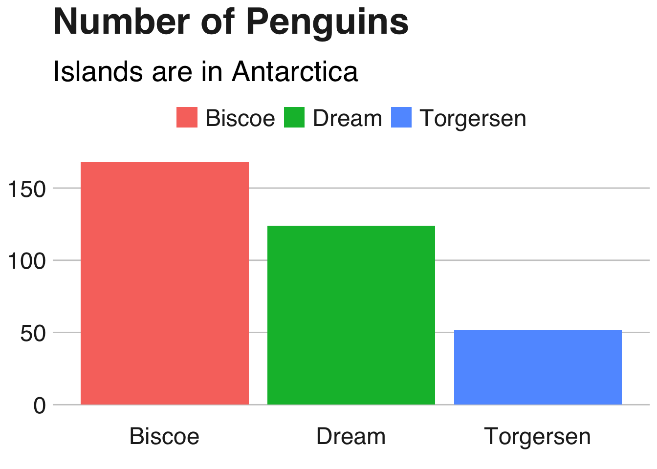
You’ve nearly re-created the penguin plot using the bbc_style() function.
Small Multiples
The bbc_style() function contains a bit more code to modify strip.background and strip.text. In ggplot, the strip refers to the text above faceted charts like the ones discussed in Chapter 2. Next, you’ll turn your penguin chart into a faceted chart to see these components of the BBC’s theme. I’ve used the code from the bbc_style() function, minus the sections that deal with small multiples, to make Figure 3.8.
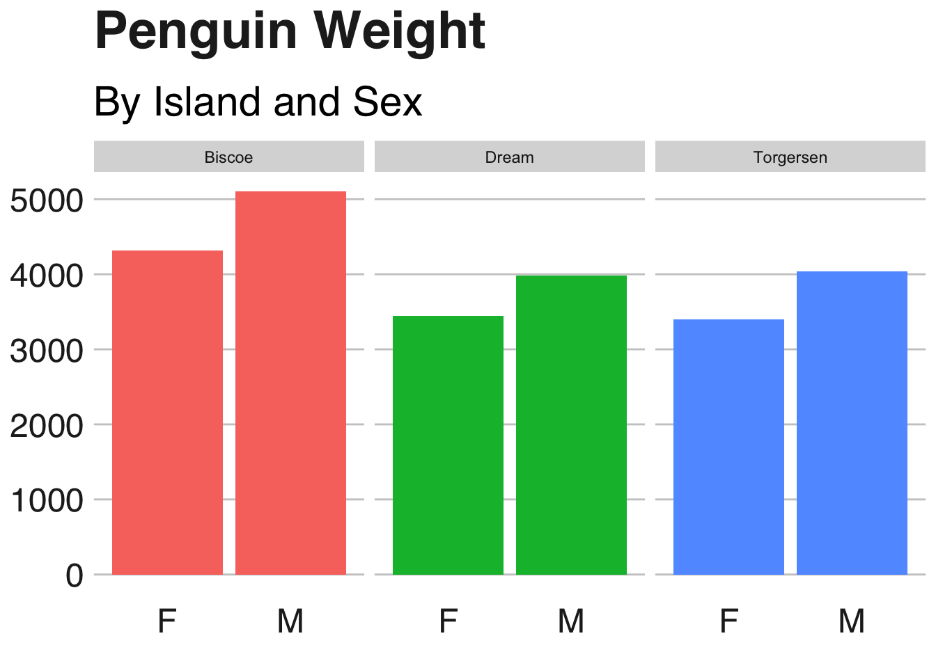
Using the facet_wrap() function to make a small multiples chart leaves you with one chart per island, but by default, the text above each small multiple is noticeably smaller than the rest of the chart. What’s more, the gray background behind the text stands out because you’ve already removed the gray background from the other parts of the chart. The consistency you’ve worked toward is now compromised, with small text that is out of proportion to the other chart text and a gray background that sticks out like a sore thumb.
The following code changes the strip text above each small multiple:
strip.background = ggplot2::element_rect(fill = "white"),
strip.text = ggplot2::element_text(size = 22, hjust = 0)
This code removes the background (or, more accurately, colors it white). Then it makes the text larger, bold, and left-aligned using hjust = 0. Note that I did have to make the text size slightly smaller than in the actual chart to fit the book, and I added code to make it bold. Figure 3.9 shows the result.
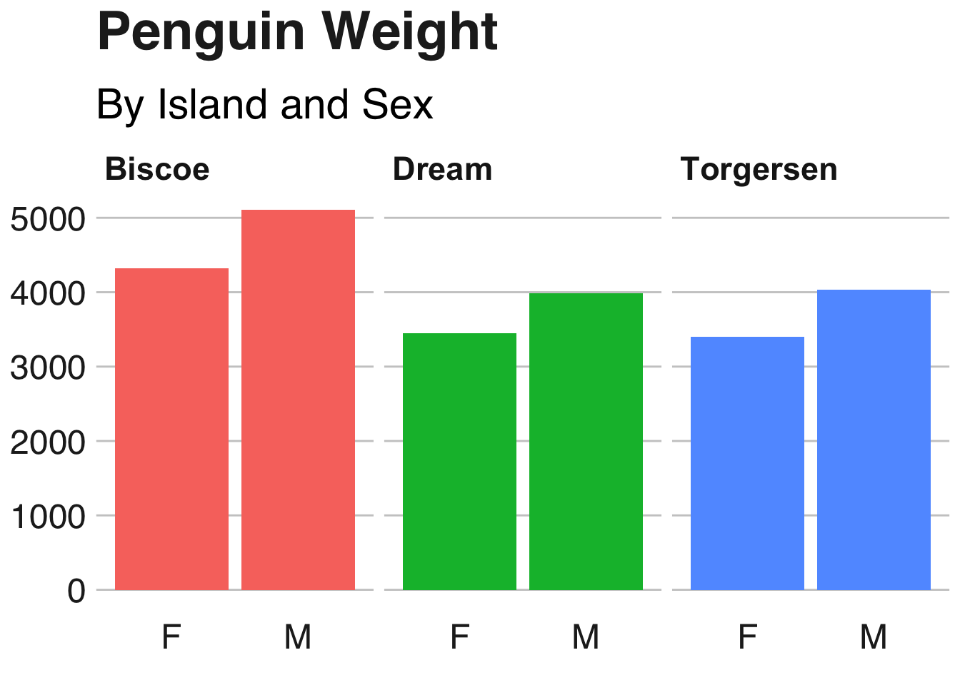
If you look at any chart on the BBC website, you’ll see how similar it looks to your own. The tweaks in the bbc_style() function to the text formatting, legends, axes, grid lines, and backgrounds show up in charts viewed by millions of people worldwide.
Color
You might be thinking, Wait, what about the color of the bars? Doesn’t the theme change those? This is a common point of confusion, but the answer is that it doesn’t. The documentation for the theme() function explains why this is the case: “Themes are a powerful way to customize the non-data components of your plots: i.e. titles, labels, fonts, background, gridlines, and legends.” In other words, ggplot themes change the elements of the chart that aren’t mapped to data.
Plots, on the other hand, use color to communicate information about data. In the faceted chart, for instance, the fill property is mapped to the island (Biscoe is salmon, Dream is green, and Torgersen is blue). As you saw in Chapter 2, you can change the fill using the various scale_fill_ functions. In the world of ggplot, these scale_ functions control color, while the custom themes control the chart’s overall look and feel.
Summary
When Stylianou and Guibourg started developing a custom theme for the BBC, they had one question: Would they be able to create graphs in R that could go directly onto the BBC website? Using ggplot, they succeeded. The bbplot package allowed them to make plots with a consistent look and feel that followed BBC standards and, most important, did not require a designer’s help.
You can see many of the principles of high-quality data visualization discussed in Chapter 2 in this custom theme. In particular, the removal of extraneous elements (axis titles and grid lines, for instance) helps keep the focus on the data itself. And because applying the theme requires users to add only a single line to their ggplot code, it was easy to get others on board. They had only to append bbc_style() to their code to produce a BBC-style plot.
Over time, others at the BBC noticed the data journalism team’s production-ready graphs and wanted to make their own. The team members set up R trainings for their colleagues and developed a “cookbook” (https://bbc.github.io/rcookbook/) showing how to make various types of charts. Soon, the quality and quantity of BBC’s data visualization exploded. Stylianou told me, “I don’t think there’s been a day where someone at the BBC hasn’t used the package to produce a graphic.”
Now that you’ve seen how custom ggplot themes work, try making one of your own. After all, once you’ve written the code, you can apply it with only one line of code.
Additional Resources
Consult the following resources to learn more about how the BBC created and used their custom theme:
BBC Visual and Data Journalism cookbook for R graphics (2019), https://bbc.github.io/rcookbook/
“How the BBC Visual and Data Journalism team works with graphics in R” by the BBC Visual and Data Journalism team (2019), https://medium.com/bbc-visual-and-data-journalism/how-the-bbc-visual-and-data-journalism-team-works-with-graphics-in-r-ed0b35693535
