2 Principles of Data Visualization
You are reading the free online version of this book. If you’d like to purchase a physical or electronic copy, you can buy it from No Starch Press, Powell’s, Barnes and Noble or Amazon.
In the spring of 2021, nearly all of the American West was in a drought. Officials in Southern California declared a water emergency in April, citing unprecedented conditions. This probably didn’t come as news to residents of California and other western states. Drought conditions like those in the West in 2021 are becoming increasingly common, yet communicating the extent of the problem remains difficult. How can this data be presented in a way that is both accurate and compelling enough to get people to take notice?
Data visualization designers Cédric Scherer and Georgios Karamanis took on this challenge in the fall of 2021 to create a graph of US drought conditions over the last two decades for the magazine Scientific American. They turned to the ggplot2 package to transform dry data (pardon the pun) from the National Drought Center into a visually arresting and impactful visualization.
This chapter delves into why the data visualization that Scherer and Karamanis created is effective and introduces you to the grammar of graphics, a theory to make sense of graphs that underlies the ggplot2 package. You’ll then learn how to use ggplot2 by re-creating the drought graph step-by-step. In the process, I’ll highlight some key principles of high-quality data visualization that you can use to improve your own work.
The Drought Visualization
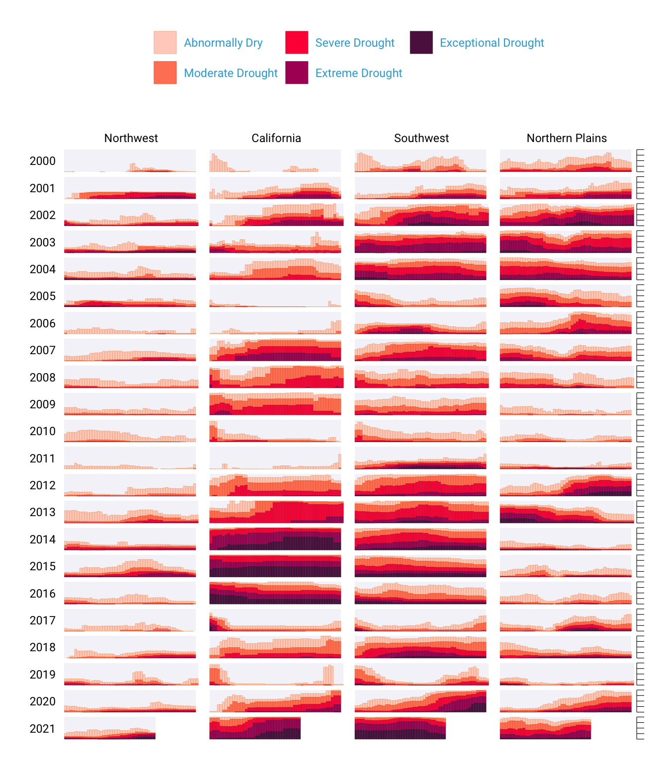
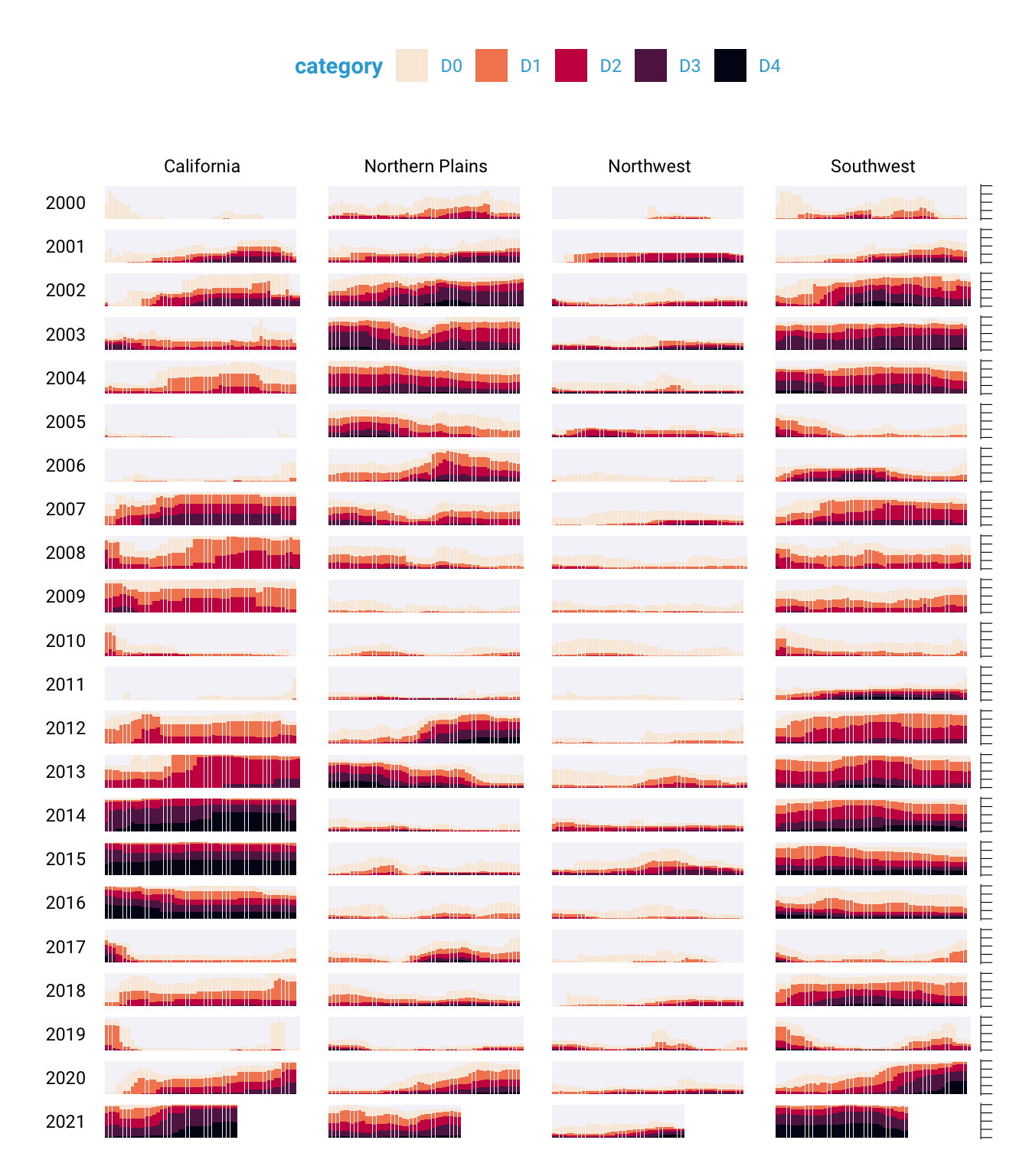
Other news organizations had relied on the same National Drought Center data in their stories, but Scherer and Karamanis visualized it so that it both grabs attention and communicates the scale of the phenomenon. Figure 2.1 shows a section of the final visualization (due to space constraints, I could include only four regions). The graph makes apparent the increase in drought conditions over the last two decades, especially in California and the Southwest.
To understand why this visualization is effective, let’s break it down.
At the broadest level, the data visualization is notable for its minimalist aesthetic. For example, there are no grid lines and few text labels, as well as minimal text along the axes. Scherer and Karamanis removed what statistician Edward Tufte, in his 1983 book The Visual Display of Quantitative Information (Graphics Press), calls chartjunk. Tufte wrote that extraneous elements often hinder, rather than help, our understanding of charts (and researchers and data visualization designers have generally agreed).
Need proof that Scherer and Karamanis’s decluttered graph is better than the alternative? Figure 2.2 shows a version with a few tweaks to the code to include grid lines and text labels on axes.

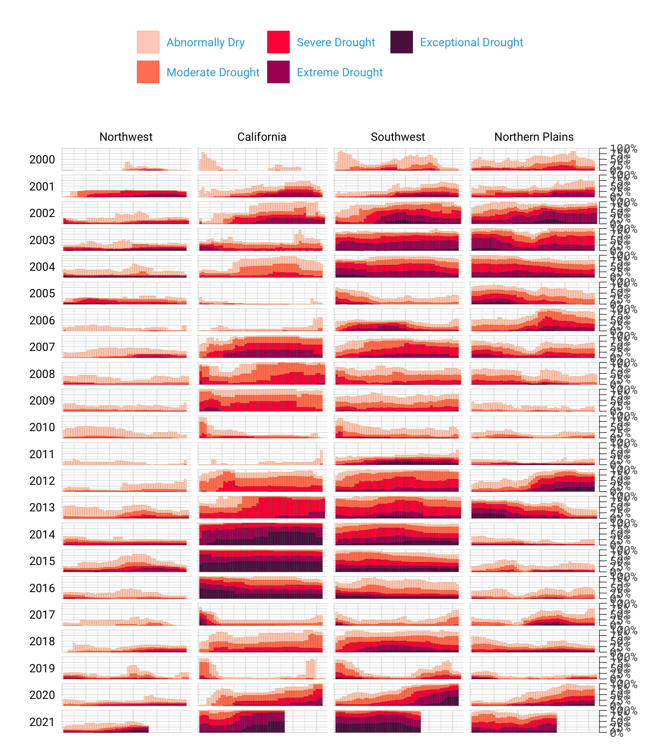
It’s not just that this cluttered version looks worse; the clutter actively inhibits understanding. Rather than focusing on overall drought patterns (the point of the graph), our brains get stuck reading repetitive and unnecessary axis text.
One of the best ways to reduce clutter is to break a single chart into a set of component charts, as Scherer and Karamanis have done (this approach, known as faceting, will be discussed further in Section 2.4.3). Each rectangle represents one region in one year. Filtering the larger chart to show the Southwest region in 2003 produces the graph shown in Figure 2.3, where the x-axis indicates the week and the y-axis indicates the percentage of that region at different drought levels.
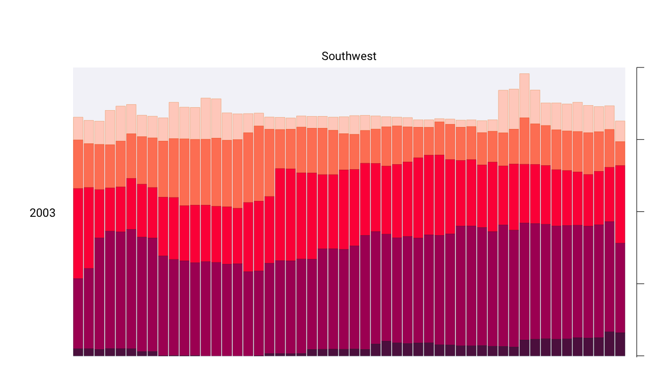
Zooming in on a single region in a single year also makes the color choices more obvious. The lightest orange bars show the percentage of the region that is abnormally dry, and the darkest purple bars show the percentage experiencing exceptional drought conditions. As you’ll see shortly, this range of colors was intentionally chosen to make differences in the drought levels visible to all readers.
Despite the graph’s complexity, the R code that Scherer and Karamanis wrote to produce it is relatively simple, due largely to a theory called the grammar of graphics.
The Grammar of Graphics
When working in Excel, you begin by selecting the type of graph you want to make. Need a bar chart? Click the bar chart icon. Need a line chart? Click the line chart icon. If you’ve only ever made charts in Excel, this first step may seem so obvious that you’ve never even given the data visualization process much thought, but in fact there are many ways to think about graphs. For example, rather than thinking of graph types as distinct, we can recognize and use their commonalities as the starting point for making them.
This approach to thinking about graphs comes from the late statistician Leland Wilkinson. For years, Wilkinson thought deeply about what data visualization is and how we can describe it. In 1999 he published a book called The Grammar of Graphics (Springer) that sought to develop a consistent way of describing all graphs. In it, Wilkinson argued that we should think of plots not as distinct types, à la Excel, but as following a grammar that we can use to describe any plot. Just as English grammar tells us that a noun is typically followed by a verb (which is why “he goes” works, while the opposite, “goes he,” does not), the grammar of graphics helps us understand why certain graph types “work.”
Thinking about data visualization through the lens of the grammar of graphics helps highlight, for example, that graphs typically have some data that is plotted on the x-axis and other data that is plotted on the y-axis. This is the case whether the graph is a bar chart or a line chart, as Figure 2.4 shows.
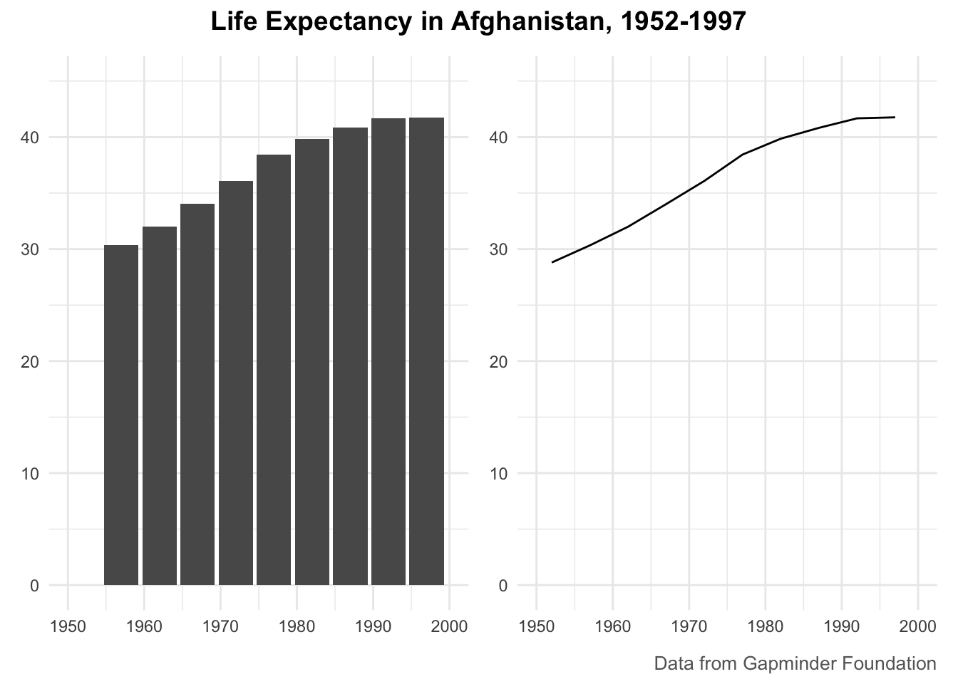
While the graphs look different (and would, to the Excel user, be different types of graphs), Wilkinson’s grammar of graphics emphasizes their similarities. (Incidentally, Wilkinson’s feelings on graph-making tools like Excel became clear when he wrote that “most charting packages channel user requests into a rigid array of chart types.”)
When Wilkinson wrote his book, no data visualization tool could implement his grammar of graphics. This would change in 2010, when Hadley Wickham announced the ggplot2 package for R in the article “A Layered Grammar of Graphics,” published in the Journal of Computational and Graphical Statistics. By providing the tools to implement Wilkinson’s ideas, ggplot2 would come to revolutionize the world of data visualization.
Working With ggplot2
The ggplot2 R package (which I, like nearly everyone in the data visualization world, will refer to simply as ggplot) relies on the idea of plots having multiple layers. This section will walk you through some of the most important ones. You’ll begin by selecting variables to map to aesthetic properties. Then you’ll choose a geometric object to use to represent your data. Next, you’ll change the aesthetic properties of your chart (its color scheme, for example) using a scale_ function. Finally, you’ll use a theme_ function to set the overall look and feel of your plot.
Mapping Data to Aesthetic Properties
To create a graph with ggplot, you begin by mapping data to aesthetic properties. All this really means is that you use elements like the x- or y-axis, color, and size (the so-called aesthetic properties) to represent variables. You’ll use the data on life expectancy in Afghanistan, introduced in Figure 2.4, to generate a plot. To access this data, enter the following code:
This code first loads the tidyverse package, introduced in Chapter 1, and then uses the read_csv() function to access data from the book’s website and assign it to the gapminder_10_rows object.
The resulting gapminder_10_rows tibble looks like this:
# A tibble: 10 × 6
   country     continent  year lifeExp      pop gdpPercap
   <chr>       <chr>     <dbl>   <dbl>    <dbl>     <dbl>
 1 Afghanistan Asia       1952    28.8  8425333      779.
 2 Afghanistan Asia       1957    30.3  9240934      821.
 3 Afghanistan Asia       1962    32.0 10267083      853.
 4 Afghanistan Asia       1967    34.0 11537966      836.
 5 Afghanistan Asia       1972    36.1 13079460      740.
 6 Afghanistan Asia       1977    38.4 14880372      786.
 7 Afghanistan Asia       1982    39.9 12881816      978.
 8 Afghanistan Asia       1987    40.8 13867957      852.
 9 Afghanistan Asia       1992    41.7 16317921      649.
10 Afghanistan Asia       1997    41.8 22227415      635.
This output is a shortened version of the full which includes over 1,700 rows of data.
Before making a chart with ggplot, you need to decide which variable to put on the x-axis and which to put on the y-axis. For data showing change over time, it’s common to put the date (in this case, year) on the x-axis and the changing value (in this case, lifeExp) on the y-axis. To do so, define the ggplot() function as follows:
This function contains numerous arguments. Each argument goes on its own line, for the sake of readability, separated by commas. The data argument tells R to use the data frame gapminder_10_rows, and the mapping argument maps year to the x-axis and lifeExp to the y-axis.
Running this code produces the chart in Figure 2.5, which doesn’t look like much yet.
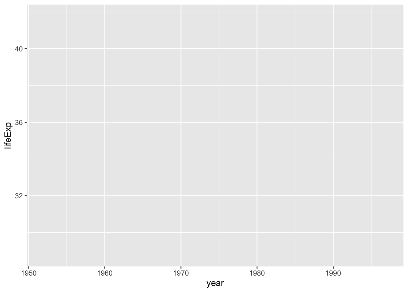
Notice that the x-axis corresponds to year and the y-axis corresponds to lifeExp, and the values on both axes match the scope of the data. In the gapminder_10_rows data frame, the first year is 1952 and the last year is 1997. The range of the x-axis has been created with this data in mind. Likewise, the values for lifeExp, which go from about 28 to about 42, will fit nicely on the y-axis.
Choosing the Geometric Objects
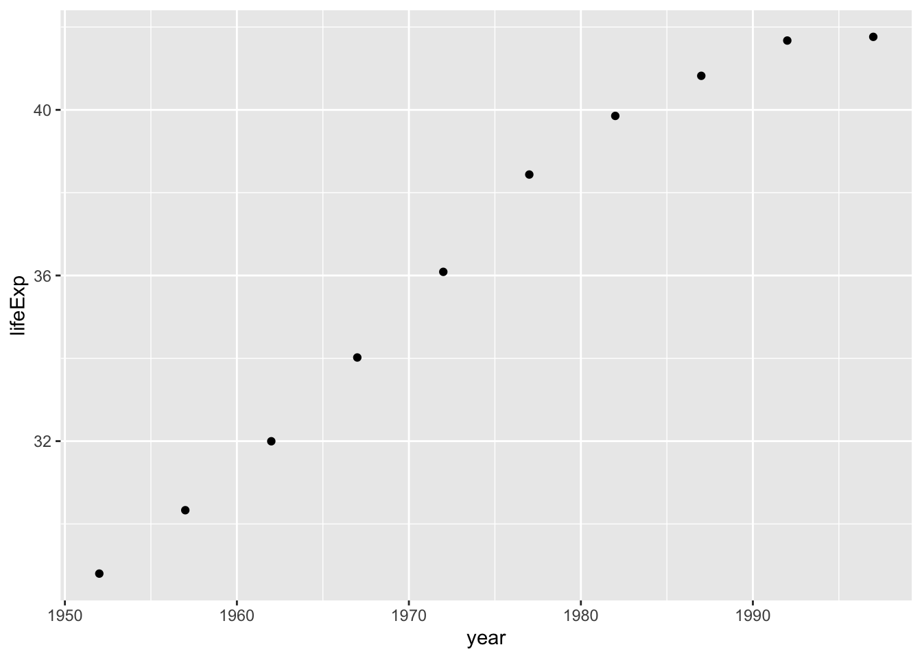
Axes are nice, but the graph is missing any type of visual representation of the data. To get this, you need to add the next ggplot layer: geoms. Short for geometric objects, geoms are functions that provide different ways of representing data. For example, to add points to the graph, you use geom_point():
ggplot(
  data = gapminder_10_rows,
  mapping = aes(
    x = year,
    y = lifeExp
  )
) +
geom_point()Now the graph shows that people in 1952 had a life expectancy of about 28 and that this value rose every year in the dataset (see Figure 2.6).
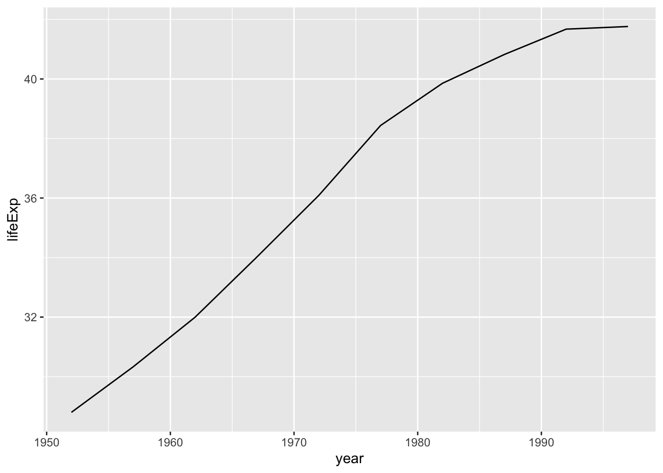
Say you change your mind and want to make a line chart instead. All you have to do is replace geom_point() with geom_line() like so:
Figure 2.7 shows the result.
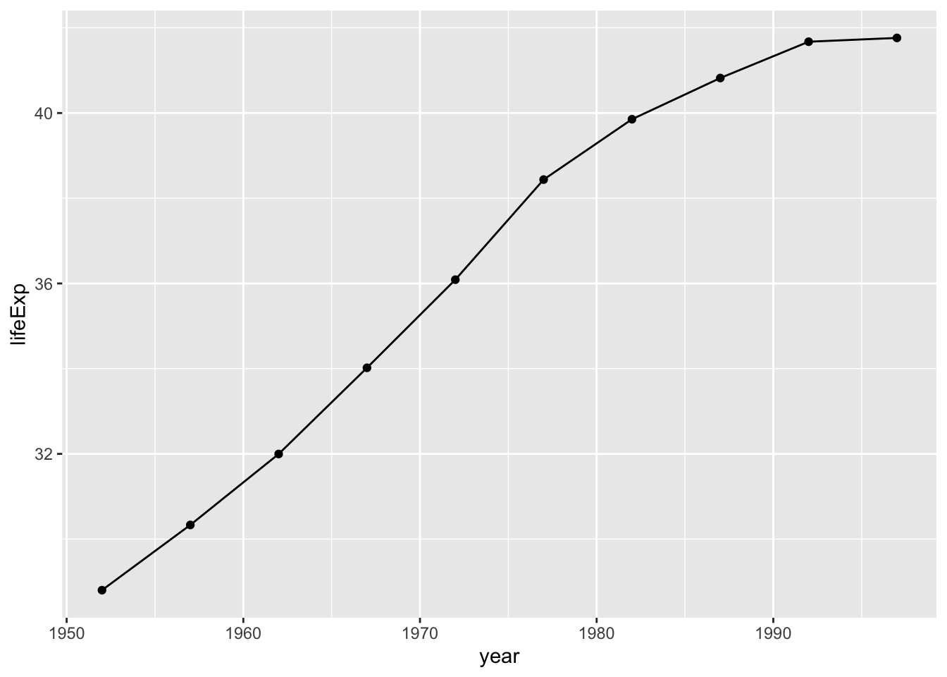
To really get fancy, you could add both geom_point() and geom_line() as follows:
ggplot(
  data = gapminder_10_rows,
  mapping = aes(
    x = year,
    y = lifeExp
  )
) +
geom_point() +
geom_line()This code generates a line chart with points, as shown in Figure 2.8.
You can swap in geom_col() to create a bar chart:
Notice in Figure 2.9 that the y-axis range has been automatically updated, going from 0 to 40 to account for the different geom.
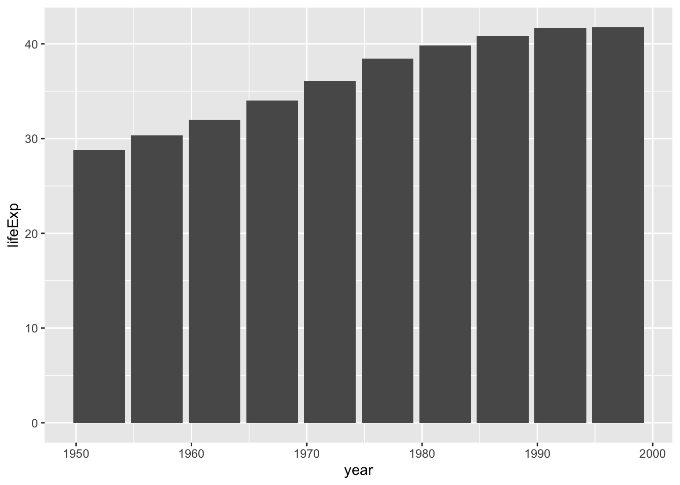
As you can see, the difference between a line chart and a bar chart isn’t as great as the Excel chart-type picker might have you believe. Both can have the same underlying properties (namely, years on the x-axis and life expectancies on the y-axis). They simply use different geometric objects to visually represent the data.
Many geoms are built into ggplot. In addition to geom_bar(), geom_point(), and geom_line(), the geoms geom_histogram(), geom_boxplot(), and geom_area() are among the most commonly used. To see all geoms, visit the ggplot documentation website at https://ggplot2.tidyverse.org/reference/index.html#geoms.
Altering Aesthetic Properties
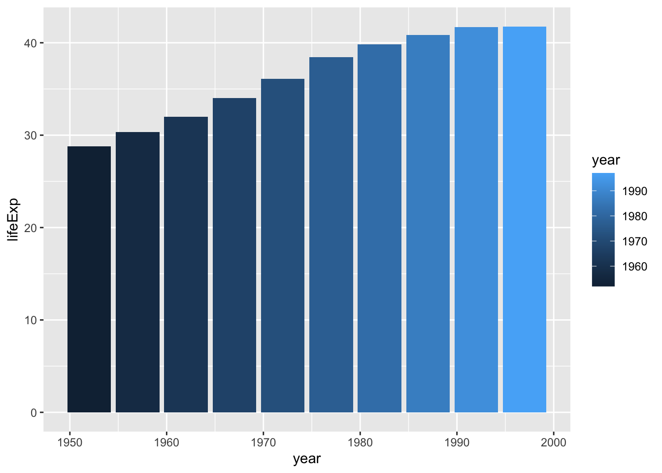
Before we return to the drought data visualization, let’s look at a few additional layers you can use to alter the bar chart. Say you want to change the color of the bars. In the grammar of graphics approach to chart-making, this means mapping some variable to the aesthetic property of fill. (For a bar chart, the aesthetic property of color would change only the outline of each bar.) In the same way that you mapped year to the x-axis and lifeExp to the y-axis, you can map fill to a variable, such as year:
Figure 2.10 shows the result. Now the fill is darker for earlier years and lighter for later years (as also indicated by the legend, added to the right of the plot).
To change the fill colors, use a new scale layer with the scale_fill _viridis_c() function (the c at the end of the function name refers to the fact that the data is continuous, meaning it can take any numeric value):
ggplot(
  data = gapminder_10_rows,
  mapping = aes(
    x = year,
    y = lifeExp,
    fill = year
  )
) +
geom_col() +
scale_fill_viridis_c()This function changes the default palette to one that is colorblind-friendly and prints well in grayscale. The scale_fill_viridis_c() function is just one of many that start with scale_ and can alter the fill scale. Chapter 11 of ggplot2: Elegant Graphics for Data Analysis, 3rd edition, discusses various color and fill scales. You can read it online at https://ggplot2-book.org/scales-colour.html.
The Fourth Layer: Setting a Theme
The final layer we’ll look at is the theme layer, which allows you to change the overall look and feel of your plots (including their background and grid lines). As with the scale_ functions, a number of functions also start with theme_. Add theme_minimal() as follows:
ggplot(
  data = gapminder_10_rows,
  mapping = aes(
    x = year,
    y = lifeExp,
    fill = year
  )
) +
  geom_col() +
scale_fill_viridis_c() +
theme_minimal()This theme starts to declutter the plot, as you can see in Figure 2.11.
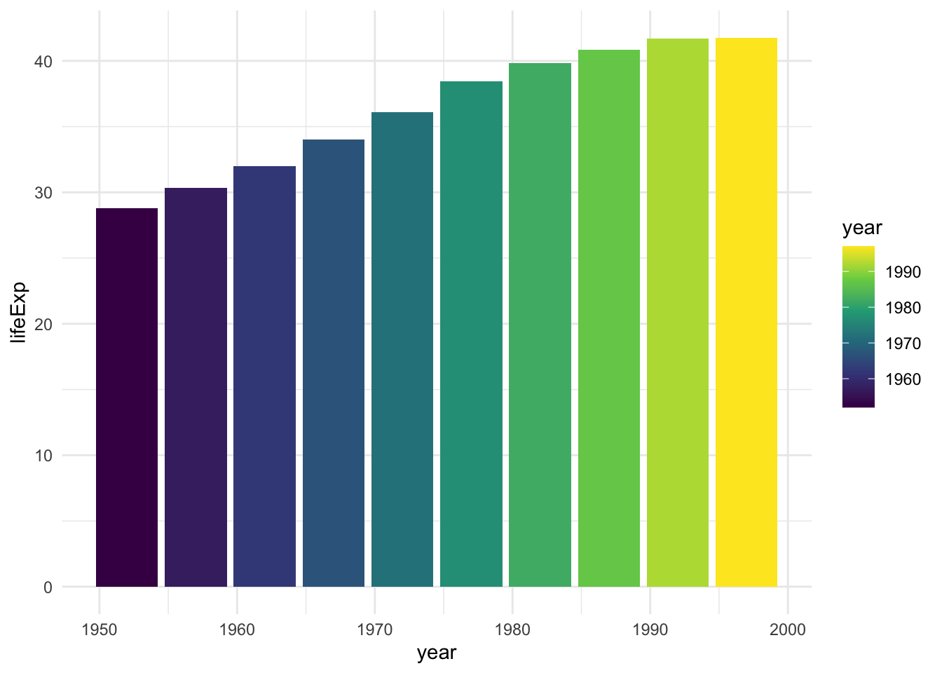
theme_minimal() added
By now, you should see why Hadley Wickham described the ggplot2 package as using a layered grammar of graphics. It implements Wilkinson’s theory by creating multiple layers: first, variables to map to aesthetic properties; second, geoms to represent the data; third, the scale_ function to adjust aesthetic properties; and finally, the theme_ function to set the plot’s overall look and feel.
You could still improve this plot in many ways, but instead let’s return to the drought data visualization by Scherer and Karamanis. By walking through their code, you’ll learn about making high-quality data visualization with ggplot and R.
Recreating the Drought Visualization with ggplot
The drought visualization code relies on a combination of ggplot fundamentals and some lesser-known tweaks that make it really shine. To understand how Scherer and Karamanis made their data visualization, we’ll start with a simplified version of their code, then build it up layer by layer, adding elements as we go.
First, you’ll import the data. Scherer and Karamanis did a bunch of data wrangling on the raw data, but I’ve saved the simplified output for you. Because it’s in JavaScript Object Notation (JSON) format, Scherer and Karamanis use the import() function from the rio package, which simplifies the process of importing JSON data:
JSON is a common format for data used in web applications, though it’s far less common in R, where it can be complicated to work with. Luckily, the rio package simplifies its import.
Plotting One Region and Year
Scherer and Karamanis’s final plot consists of many years and regions. To see how they created it, we’ll start by looking at just the Southwest region in 2003.
First, you need to create a data frame. You’ll use the filter() function twice: the first time to keep only data for the Southwest region, and the second time to keep only data from 2003. In both cases, you use the following syntax:
filter(variable_name == value)This tells R to keep only observations where variable_name is equal to some value. The code starts with the dm_perc_cat_hubs_raw data frame before filtering it and then saving it as a new object called southwest_2003:
To take a look at this object and see the variables you have to work with, enter southwest_2003 in the console, which should return this output:
          date       hub category percentage year week max_week
1   2003-12-30 Southwest       D0     0.0718 2003   52       52
2   2003-12-30 Southwest       D1     0.0828 2003   52       52
3   2003-12-30 Southwest       D2     0.2693 2003   52       52
4   2003-12-30 Southwest       D3     0.3108 2003   52       52
5   2003-12-30 Southwest       D4     0.0796 2003   52       52
6   2003-12-23 Southwest       D0     0.0823 2003   51       52
7   2003-12-23 Southwest       D1     0.1312 2003   51       52
8   2003-12-23 Southwest       D2     0.1886 2003   51       52
9   2003-12-23 Southwest       D3     0.3822 2003   51       52
10  2003-12-23 Southwest       D4     0.0828 2003   51       52
11  2003-12-16 Southwest       D0     0.0875 2003   50       52
12  2003-12-16 Southwest       D1     0.1372 2003   50       52
13  2003-12-16 Southwest       D2     0.1855 2003   50       52
14  2003-12-16 Southwest       D3     0.3916 2003   50       52
15  2003-12-16 Southwest       D4     0.0625 2003   50       52
16  2003-12-09 Southwest       D0     0.0950 2003   49       52
17  2003-12-09 Southwest       D1     0.1448 2003   49       52
18  2003-12-09 Southwest       D2     0.1792 2003   49       52
19  2003-12-09 Southwest       D3     0.3879 2003   49       52
20  2003-12-09 Southwest       D4     0.0615 2003   49       52
21  2003-12-02 Southwest       D0     0.1015 2003   48       52
22  2003-12-02 Southwest       D1     0.1403 2003   48       52
23  2003-12-02 Southwest       D2     0.1847 2003   48       52
24  2003-12-02 Southwest       D3     0.3902 2003   48       52
25  2003-12-02 Southwest       D4     0.0624 2003   48       52
26  2003-11-25 Southwest       D0     0.0937 2003   47       52
27  2003-11-25 Southwest       D1     0.1372 2003   47       52
28  2003-11-25 Southwest       D2     0.1907 2003   47       52
29  2003-11-25 Southwest       D3     0.3932 2003   47       52
30  2003-11-25 Southwest       D4     0.0584 2003   47       52
31  2003-11-18 Southwest       D0     0.0935 2003   46       52
32  2003-11-18 Southwest       D1     0.1382 2003   46       52
33  2003-11-18 Southwest       D2     0.1954 2003   46       52
34  2003-11-18 Southwest       D3     0.3928 2003   46       52
35  2003-11-18 Southwest       D4     0.0571 2003   46       52
36  2003-11-11 Southwest       D0     0.0786 2003   45       52
37  2003-11-11 Southwest       D1     0.1386 2003   45       52
38  2003-11-11 Southwest       D2     0.2040 2003   45       52
39  2003-11-11 Southwest       D3     0.3971 2003   45       52
40  2003-11-11 Southwest       D4     0.0587 2003   45       52
41  2003-11-04 Southwest       D0     0.1174 2003   44       52
42  2003-11-04 Southwest       D1     0.1404 2003   44       52
43  2003-11-04 Southwest       D2     0.2054 2003   44       52
44  2003-11-04 Southwest       D3     0.4013 2003   44       52
45  2003-11-04 Southwest       D4     0.0571 2003   44       52
46  2003-10-28 Southwest       D0     0.1530 2003   43       52
47  2003-10-28 Southwest       D1     0.1612 2003   43       52
48  2003-10-28 Southwest       D2     0.2038 2003   43       52
49  2003-10-28 Southwest       D3     0.4056 2003   43       52
50  2003-10-28 Southwest       D4     0.0547 2003   43       52
51  2003-10-21 Southwest       D0     0.1391 2003   42       52
52  2003-10-21 Southwest       D1     0.1208 2003   42       52
53  2003-10-21 Southwest       D2     0.2294 2003   42       52
54  2003-10-21 Southwest       D3     0.4053 2003   42       52
55  2003-10-21 Southwest       D4     0.0302 2003   42       52
56  2003-10-14 Southwest       D0     0.1479 2003   41       52
57  2003-10-14 Southwest       D1     0.1145 2003   41       52
58  2003-10-14 Southwest       D2     0.2049 2003   41       52
59  2003-10-14 Southwest       D3     0.4211 2003   41       52
60  2003-10-14 Southwest       D4     0.0325 2003   41       52
61  2003-10-07 Southwest       D0     0.0400 2003   40       52
62  2003-10-07 Southwest       D1     0.1067 2003   40       52
63  2003-10-07 Southwest       D2     0.2411 2003   40       52
64  2003-10-07 Southwest       D3     0.3978 2003   40       52
65  2003-10-07 Southwest       D4     0.0327 2003   40       52
66  2003-09-30 Southwest       D0     0.0416 2003   39       52
67  2003-09-30 Southwest       D1     0.1120 2003   39       52
68  2003-09-30 Southwest       D2     0.2171 2003   39       52
69  2003-09-30 Southwest       D3     0.4095 2003   39       52
70  2003-09-30 Southwest       D4     0.0352 2003   39       52
71  2003-09-23 Southwest       D0     0.0233 2003   38       52
72  2003-09-23 Southwest       D1     0.1146 2003   38       52
73  2003-09-23 Southwest       D2     0.2302 2003   38       52
74  2003-09-23 Southwest       D3     0.4156 2003   38       52
75  2003-09-23 Southwest       D4     0.0344 2003   38       52
76  2003-09-16 Southwest       D0     0.0247 2003   37       52
77  2003-09-16 Southwest       D1     0.1151 2003   37       52
78  2003-09-16 Southwest       D2     0.2278 2003   37       52
79  2003-09-16 Southwest       D3     0.4153 2003   37       52
80  2003-09-16 Southwest       D4     0.0344 2003   37       52
81  2003-09-09 Southwest       D0     0.0184 2003   36       52
82  2003-09-09 Southwest       D1     0.1222 2003   36       52
83  2003-09-09 Southwest       D2     0.2579 2003   36       52
84  2003-09-09 Southwest       D3     0.3848 2003   36       52
85  2003-09-09 Southwest       D4     0.0377 2003   36       52
86  2003-09-02 Southwest       D0     0.0115 2003   35       52
87  2003-09-02 Southwest       D1     0.1145 2003   35       52
88  2003-09-02 Southwest       D2     0.2790 2003   35       52
89  2003-09-02 Southwest       D3     0.3794 2003   35       52
90  2003-09-02 Southwest       D4     0.0380 2003   35       52
91  2003-08-26 Southwest       D0     0.0261 2003   34       52
92  2003-08-26 Southwest       D1     0.0966 2003   34       52
93  2003-08-26 Southwest       D2     0.2763 2003   34       52
94  2003-08-26 Southwest       D3     0.3745 2003   34       52
95  2003-08-26 Southwest       D4     0.0448 2003   34       52
96  2003-08-19 Southwest       D0     0.0261 2003   33       52
97  2003-08-19 Southwest       D1     0.1059 2003   33       52
98  2003-08-19 Southwest       D2     0.2785 2003   33       52
99  2003-08-19 Southwest       D3     0.3636 2003   33       52
100 2003-08-19 Southwest       D4     0.0445 2003   33       52
101 2003-08-12 Southwest       D0     0.0324 2003   32       52
102 2003-08-12 Southwest       D1     0.1216 2003   32       52
103 2003-08-12 Southwest       D2     0.2585 2003   32       52
104 2003-08-12 Southwest       D3     0.3713 2003   32       52
105 2003-08-12 Southwest       D4     0.0423 2003   32       52
106 2003-08-05 Southwest       D0     0.0307 2003   31       52
107 2003-08-05 Southwest       D1     0.1334 2003   31       52
108 2003-08-05 Southwest       D2     0.2544 2003   31       52
109 2003-08-05 Southwest       D3     0.3645 2003   31       52
110 2003-08-05 Southwest       D4     0.0447 2003   31       52
111 2003-07-29 Southwest       D0     0.0354 2003   30       52
112 2003-07-29 Southwest       D1     0.1362 2003   30       52
113 2003-07-29 Southwest       D2     0.2361 2003   30       52
114 2003-07-29 Southwest       D3     0.3712 2003   30       52
115 2003-07-29 Southwest       D4     0.0504 2003   30       52
116 2003-07-22 Southwest       D0     0.0458 2003   29       52
117 2003-07-22 Southwest       D1     0.1187 2003   29       52
118 2003-07-22 Southwest       D2     0.2367 2003   29       52
119 2003-07-22 Southwest       D3     0.3899 2003   29       52
120 2003-07-22 Southwest       D4     0.0407 2003   29       52
121 2003-07-15 Southwest       D0     0.0527 2003   28       52
122 2003-07-15 Southwest       D1     0.1137 2003   28       52
123 2003-07-15 Southwest       D2     0.2502 2003   28       52
124 2003-07-15 Southwest       D3     0.3954 2003   28       52
125 2003-07-15 Southwest       D4     0.0220 2003   28       52
126 2003-07-08 Southwest       D0     0.0651 2003   27       52
127 2003-07-08 Southwest       D1     0.1216 2003   27       52
128 2003-07-08 Southwest       D2     0.2652 2003   27       52
129 2003-07-08 Southwest       D3     0.3576 2003   27       52
130 2003-07-08 Southwest       D4     0.0234 2003   27       52
131 2003-07-01 Southwest       D0     0.0588 2003   26       52
132 2003-07-01 Southwest       D1     0.1256 2003   26       52
133 2003-07-01 Southwest       D2     0.2757 2003   26       52
134 2003-07-01 Southwest       D3     0.3466 2003   26       52
135 2003-07-01 Southwest       D4     0.0223 2003   26       52
136 2003-06-24 Southwest       D0     0.0458 2003   25       52
137 2003-06-24 Southwest       D1     0.1538 2003   25       52
138 2003-06-24 Southwest       D2     0.2570 2003   25       52
139 2003-06-24 Southwest       D3     0.3483 2003   25       52
140 2003-06-24 Southwest       D4     0.0228 2003   25       52
141 2003-06-17 Southwest       D0     0.0412 2003   24       52
142 2003-06-17 Southwest       D1     0.1611 2003   24       52
143 2003-06-17 Southwest       D2     0.2573 2003   24       52
144 2003-06-17 Southwest       D3     0.3484 2003   24       52
145 2003-06-17 Southwest       D4     0.0224 2003   24       52
146 2003-06-10 Southwest       D0     0.0416 2003   23       52
147 2003-06-10 Southwest       D1     0.1552 2003   23       52
148 2003-06-10 Southwest       D2     0.2988 2003   23       52
149 2003-06-10 Southwest       D3     0.3132 2003   23       52
150 2003-06-10 Southwest       D4     0.0219 2003   23       52
151 2003-06-03 Southwest       D0     0.0387 2003   22       52
152 2003-06-03 Southwest       D1     0.1584 2003   22       52
153 2003-06-03 Southwest       D2     0.2991 2003   22       52
154 2003-06-03 Southwest       D3     0.3278 2003   22       52
155 2003-06-03 Southwest       D4     0.0077 2003   22       52
156 2003-05-27 Southwest       D0     0.0391 2003   21       52
157 2003-05-27 Southwest       D1     0.1373 2003   21       52
158 2003-05-27 Southwest       D2     0.3193 2003   21       52
159 2003-05-27 Southwest       D3     0.3218 2003   21       52
160 2003-05-27 Southwest       D4     0.0072 2003   21       52
161 2003-05-20 Southwest       D0     0.0427 2003   20       52
162 2003-05-20 Southwest       D1     0.1354 2003   20       52
163 2003-05-20 Southwest       D2     0.3191 2003   20       52
164 2003-05-20 Southwest       D3     0.3225 2003   20       52
165 2003-05-20 Southwest       D4     0.0075 2003   20       52
166 2003-05-13 Southwest       D0     0.0426 2003   19       52
167 2003-05-13 Southwest       D1     0.2331 2003   19       52
168 2003-05-13 Southwest       D2     0.2316 2003   19       52
169 2003-05-13 Southwest       D3     0.3132 2003   19       52
170 2003-05-13 Southwest       D4     0.0075 2003   19       52
171 2003-05-06 Southwest       D0     0.0449 2003   18       52
172 2003-05-06 Southwest       D1     0.2606 2003   18       52
173 2003-05-06 Southwest       D2     0.2421 2003   18       52
174 2003-05-06 Southwest       D3     0.2940 2003   18       52
175 2003-05-06 Southwest       D4     0.0001 2003   18       52
176 2003-04-29 Southwest       D0     0.0666 2003   17       52
177 2003-04-29 Southwest       D1     0.2418 2003   17       52
178 2003-04-29 Southwest       D2     0.2400 2003   17       52
179 2003-04-29 Southwest       D3     0.2915 2003   17       52
180 2003-04-22 Southwest       D0     0.0891 2003   16       52
181 2003-04-22 Southwest       D1     0.2384 2003   16       52
182 2003-04-22 Southwest       D2     0.1925 2003   16       52
183 2003-04-22 Southwest       D3     0.3189 2003   16       52
184 2003-04-15 Southwest       D0     0.0953 2003   15       52
185 2003-04-15 Southwest       D1     0.2307 2003   15       52
186 2003-04-15 Southwest       D2     0.1990 2003   15       52
187 2003-04-15 Southwest       D3     0.3176 2003   15       52
188 2003-04-08 Southwest       D0     0.1366 2003   14       52
189 2003-04-08 Southwest       D1     0.2364 2003   14       52
190 2003-04-08 Southwest       D2     0.1948 2003   14       52
191 2003-04-08 Southwest       D3     0.3235 2003   14       52
192 2003-04-01 Southwest       D0     0.1430 2003   13       52
193 2003-04-01 Southwest       D1     0.2283 2003   13       52
194 2003-04-01 Southwest       D2     0.1957 2003   13       52
195 2003-04-01 Southwest       D3     0.3267 2003   13       52
196 2003-03-25 Southwest       D0     0.1110 2003   12       52
197 2003-03-25 Southwest       D1     0.2279 2003   12       52
198 2003-03-25 Southwest       D2     0.1998 2003   12       52
199 2003-03-25 Southwest       D3     0.3220 2003   12       52
200 2003-03-25 Southwest       D4     0.0006 2003   12       52
201 2003-03-18 Southwest       D0     0.1101 2003   11       52
202 2003-03-18 Southwest       D1     0.2316 2003   11       52
203 2003-03-18 Southwest       D2     0.1915 2003   11       52
204 2003-03-18 Southwest       D3     0.3287 2003   11       52
205 2003-03-18 Southwest       D4     0.0003 2003   11       52
206 2003-03-11 Southwest       D0     0.1260 2003   10       52
207 2003-03-11 Southwest       D1     0.2042 2003   10       52
208 2003-03-11 Southwest       D2     0.2150 2003   10       52
209 2003-03-11 Southwest       D3     0.3332 2003   10       52
210 2003-03-11 Southwest       D4     0.0007 2003   10       52
211 2003-03-04 Southwest       D0     0.0807 2003    9       52
212 2003-03-04 Southwest       D1     0.1943 2003    9       52
213 2003-03-04 Southwest       D2     0.2040 2003    9       52
214 2003-03-04 Southwest       D3     0.3459 2003    9       52
215 2003-03-04 Southwest       D4     0.0002 2003    9       52
216 2003-02-25 Southwest       D0     0.0753 2003    8       52
217 2003-02-25 Southwest       D1     0.1721 2003    8       52
218 2003-02-25 Southwest       D2     0.1752 2003    8       52
219 2003-02-25 Southwest       D3     0.3936 2003    8       52
220 2003-02-25 Southwest       D4     0.0146 2003    8       52
221 2003-02-18 Southwest       D0     0.0743 2003    7       52
222 2003-02-18 Southwest       D1     0.1649 2003    7       52
223 2003-02-18 Southwest       D2     0.1837 2003    7       52
224 2003-02-18 Southwest       D3     0.3970 2003    7       52
225 2003-02-18 Southwest       D4     0.0144 2003    7       52
226 2003-02-11 Southwest       D0     0.1017 2003    6       52
227 2003-02-11 Southwest       D1     0.1548 2003    6       52
228 2003-02-11 Southwest       D2     0.1765 2003    6       52
229 2003-02-11 Southwest       D3     0.4142 2003    6       52
230 2003-02-11 Southwest       D4     0.0243 2003    6       52
231 2003-02-04 Southwest       D0     0.1212 2003    5       52
232 2003-02-04 Southwest       D1     0.1591 2003    5       52
233 2003-02-04 Southwest       D2     0.1558 2003    5       52
234 2003-02-04 Southwest       D3     0.4053 2003    5       52
235 2003-02-04 Southwest       D4     0.0245 2003    5       52
236 2003-01-28 Southwest       D0     0.1196 2003    4       52
237 2003-01-28 Southwest       D1     0.1496 2003    4       52
238 2003-01-28 Southwest       D2     0.1501 2003    4       52
239 2003-01-28 Southwest       D3     0.4073 2003    4       52
240 2003-01-28 Southwest       D4     0.0247 2003    4       52
241 2003-01-21 Southwest       D0     0.0807 2003    3       52
242 2003-01-21 Southwest       D1     0.1567 2003    3       52
243 2003-01-21 Southwest       D2     0.1676 2003    3       52
244 2003-01-21 Southwest       D3     0.3867 2003    3       52
245 2003-01-21 Southwest       D4     0.0219 2003    3       52
246 2003-01-14 Southwest       D0     0.0808 2003    2       52
247 2003-01-14 Southwest       D1     0.1521 2003    2       52
248 2003-01-14 Southwest       D2     0.2807 2003    2       52
249 2003-01-14 Southwest       D3     0.2784 2003    2       52
250 2003-01-14 Southwest       D4     0.0244 2003    2       52
251 2003-01-07 Southwest       D0     0.0791 2003    1       52
252 2003-01-07 Southwest       D1     0.1684 2003    1       52
253 2003-01-07 Southwest       D2     0.3125 2003    1       52
254 2003-01-07 Southwest       D3     0.2433 2003    1       52
255 2003-01-07 Southwest       D4     0.0242 2003    1       52
The date variable represents the start date of the week in which the observation took place. The hub variable is the region, and category is the level of drought: a value of D0 indicates the lowest level of drought, while D5 indicates the highest level. The percentage variable is the percentage of that region in that drought category, ranging from 0 to 1. The year and week variables are the observation year and week number (beginning with week 1). The max_week variable is the maximum number of weeks in a given year.
Now you can use this southwest_2003 object for your plot:
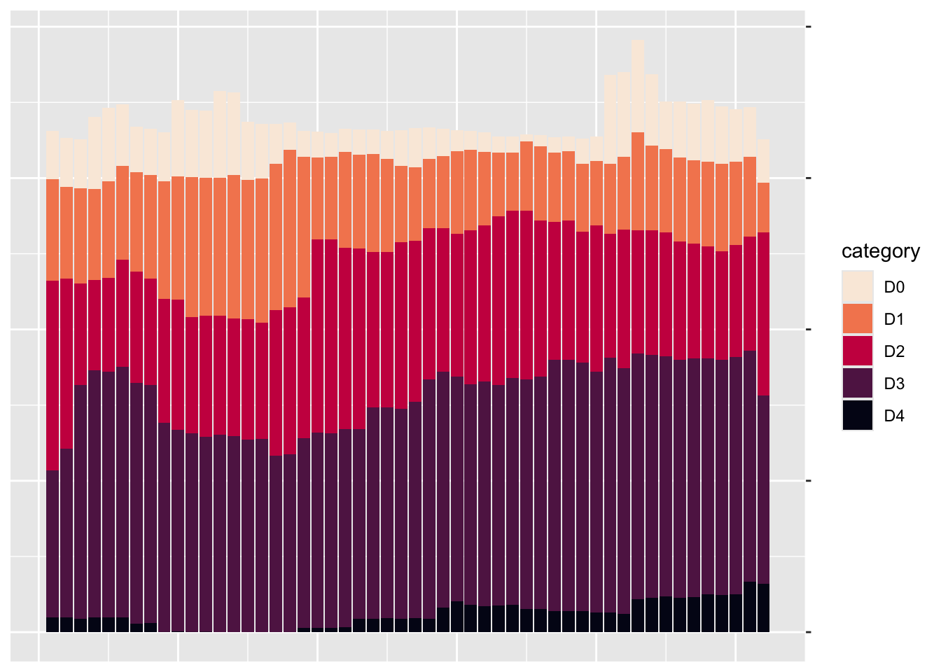
The ggplot() function tells R to put week on the x-axis and percentage on the y-axis, as well as to use the category variable for the fill color. The geom_col() function creates a bar chart in which each bar’s fill color represents the percentage of the region at each drought level for that particular week, as shown in Figure 2.12.
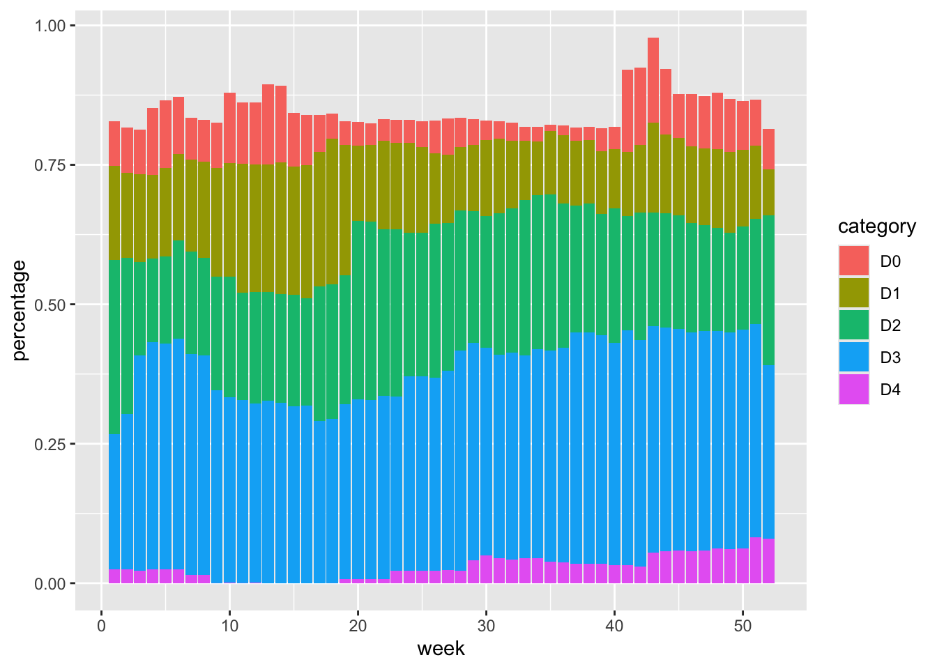
The colors, which include bright pinks, blues, greens, and reds, don’t match the final version of the plot, but you can start to see the outlines of Scherer and Karamanis’s data visualization.
Changing Aesthetic Properties
Scherer and Karamanis next selected different fill colors for their bars. To do so, they used the scale_fill_viridis_d() function. The d here means that the data to which the fill scale is being applied has discrete categories (D0, D1, D2, D3, D4, and D5):
ggplot(
  data = southwest_2003,
  aes(
    x = week,
    y = percentage,
    fill = category
  )
) +
geom_col() +
scale_fill_viridis_d(
option = "rocket",
direction = -1
)They used the argument option = "rocket" to select the rocket palette, whose colors range from cream to nearly black. You could use several other palettes within the scale_fill_viridis_d() function; see them at https://sjmgarnier.github.io/viridisLite/reference/viridis.html.
Then they used the direction = -1 argument to reverse the order of fill colors so that darker colors mean higher drought conditions.
Scherer and Karamanis also tweaked the appearance of the x- and y-axes:
ggplot(
  data = southwest_2003,
  aes(
    x = week,
    y = percentage,
    fill = category
  )
) +
  geom_col() +
  scale_fill_viridis_d(
    option = "rocket",
    direction = -1
) +
scale_x_continuous(
name = NULL,
guide = "none"
) +
scale_y_continuous(
name = NULL,
labels = NULL,
position = "right"
)On the x-axis, they removed both the axis title (“week”) using name = NULL and the axis labels (the weeks numbered 0 to 50) with guide = "none". On the y-axis, they removed the title and text showing percentages using labels = NULL, which functionally does the same thing as guide = "none". They also moved the axis lines themselves to the right side using position = "right". These axis lines are apparent only as tick marks at this point but will become more visible later. Figure 2.13 shows the result of these tweaks.
Up to this point, we’ve focused on one of the single plots that make up the larger data visualization. But the final product that Scherer and Karamanis made is actually 176 plots visualizing 22 years and 8 regions. Let’s discuss the ggplot feature they used to create all of these plots.
Faceting the Plot
One of ggplot’s most useful capabilities is faceting (or, as it’s more commonly known in the data visualization world, small multiples). Faceting uses a variable to break down a single plot into multiple plots. For example, think of a line chart showing life expectancy by country over time; instead of multiple lines on one plot, faceting would create multiple plots with one line per plot. To specify which variable to put in the rows and which to put in the columns of your faceted plot, you use the facet_grid() function, as Scherer and Karamanis did in their code:
dm_perc_cat_hubs %>%
  filter(hub %in% c(
    "Northwest",
    "California",
    "Southwest",
    "Northern Plains"
  )) %>%
  ggplot(aes(
    x = week,
    y = percentage,
    fill = category
  )) +
  geom_col() +
  scale_fill_viridis_d(
    option = "rocket",
    direction = -1
  ) +
  scale_x_continuous(
    name = NULL,
    guide = "none"
  ) +
  scale_y_continuous(
    name = NULL,
    labels = NULL,
    position = "right"
  ) +
  facet_grid(
    rows = vars(year),
    cols = vars(hub),
    switch = "y"
  )
Scherer and Karamanis put year in rows and hub (region) in columns. The switch = "y" argument moves the year label from the right side (where it appears by default) to the left. With this code in place, you can see the final plot coming together in Figure 2.14.
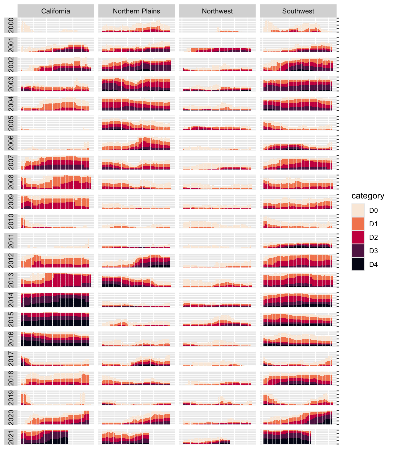
Incredibly, the broad outlines of the plot took just 10 lines of code to create. The rest of the code falls into the category of small polishes. That’s not to minimize how important small polishes are (very) or the time it takes to create them (a lot). It does show, however, that a little bit of ggplot goes a long way.
Adding Final Polishes
Now let’s look at a few of the small polishes that Scherer and Karamanis made. The first is to apply a theme. They used theme_light(), which removes the default gray background and changes the font to Roboto using the base_family argument.
The theme_light() function is what’s known as a complete theme, one that changes the overall look and feel of a plot. The ggplot package has multiple complete themes that you can use (they’re listed at https://ggplot2.tidyverse.org/reference/index.html#themes). Individuals and organizations also make their own themes, as you’ll do in Chapter 3. For a discussion of which themes you might consider using, see my blog post at https://rfortherestofus.com/2019/08/themes-to-improve-your-ggplot-figures.
Scherer and Karamanis didn’t stop by simply applying theme_light(). They also used the theme() function to make additional tweaks to the plot’s design:
dm_perc_cat_hubs %>%
  filter(hub %in% c(
    "Northwest",
    "California",
    "Southwest",
    "Northern Plains"
  )) %>%
  ggplot(aes(
    x = week,
    y = percentage,
    fill = category
  )) +
  geom_rect(
    aes(
      xmin = .5,
      xmax = max_week + .5,
      ymin = -0.005,
      ymax = 1
    ),
    fill = "#f4f4f9",
    color = NA,
    size = 0.4
  ) +
  geom_col() +
  scale_fill_viridis_d(
    option = "rocket",
    direction = -1
  ) +
  scale_x_continuous(
    name = NULL,
    guide = "none"
  ) +
  scale_y_continuous(
    name = NULL,
    labels = NULL,
    position = "right"
  ) +
  facet_grid(
    rows = vars(year),
    cols = vars(hub),
    switch = "y"
  ) +
  theme_light(base_family = "Roboto") +
  theme(
    axis.title = element_text(
      size = 14,
      color = "black"
    ),
    axis.text = element_text(
      family = "Roboto Mono",
      size = 11
    ),
    axis.line.x = element_blank(),
    axis.line.y = element_line(
      color = "black",
      size = .2
    ),
    axis.ticks.y = element_line(
      color = "black",
      size = .2
    ),
    axis.ticks.length.y = unit(2, "mm"),
    legend.position = "top",
    legend.title = element_text(
      color = "#2DAADA",
      face = "bold"
    ),
    legend.text = element_text(color = "#2DAADA"),
    strip.text.x = element_text(
      hjust = .5,
      face = "plain",
      color = "black",
      margin = margin(t = 20, b = 5)
    ),
    strip.text.y.left = element_text(
      angle = 0,
      vjust = .5,
      face = "plain",
      color = "black"
    ),
    strip.background = element_rect(
      fill = "transparent",
      color = "transparent"
    ),
    panel.grid.minor = element_blank(),
    panel.grid.major = element_blank(),
    panel.spacing.x = unit(0.3, "lines"),
    panel.spacing.y = unit(0.25, "lines"),
    panel.background = element_rect(
      fill = "transparent",
      color = "transparent"
    ),
    panel.border = element_rect(
      color = "transparent",
      size = 0
    ),
    plot.background = element_rect(
      fill = "transparent",
      color = "transparent",
      size = .4
    ),
    plot.margin = margin(rep(18, 4))
  )
The code in the theme() function does many different things, but let’s look at a few of the most important. First, it moves the legend from the right side (the default) to the top of the plot. Then, the angle = 0 argument rotates the year text in the columns from vertical to horizontal. Without this argument, the years would be much less legible.
The theme() function also makes the distinctive axis lines and ticks that appear on the right side of the final plot. Calling element_blank() removes all grid lines. Finally, this code removes the borders and gives each individual plot a transparent background.
You might be thinking, Wait. Didn’t the individual plots have a gray background behind them? Yes, dear reader, they did. Scherer and Karamanis made these with a separate geom, geom_rect():
They also set some additional aesthetic properties specific to this geom — xmin, xmax, ymin, and ymax — which determine the boundaries of the rectangle it produces. The result is a gray background behind each small multiple, as shown in Figure 2.15.
Finally, Scherer and Karamanis made some tweaks to the legend. Previously you saw a simplified version of the scale_fill_viridis_d() function. Here’s a more complete version:
scale_fill_viridis_d(
  option = "rocket",
  direction = -1,
  name = "Category:",
  labels = c(
    "Abnormally Dry",
    "Moderate Drought",
    "Severe Drought",
    "Extreme Drought",
    "Exceptional Drought"
  )
)
The name argument sets the legend title, and the labels argument specifies the labels that show up in the legend. Figure 2.16 shows the result of these changes.

Rather than D0, D1, D2, D3, and D4, the legend text now reads Abnormally Dry, Moderate Drought, Severe Drought, Extreme Drought, and Exceptional Drought — much more user-friendly categories.
The Complete Visualization Code
While I’ve shown you a nearly complete version of the code that Scherer and Karamanis wrote, I made some small changes to make it easier to understand. If you’re curious, the full code is here:
ggplot(dm_perc_cat_hubs, aes(week, percentage)) +
  geom_rect(
    aes(
      xmin = .5,
      xmax = max_week + .5,
      ymin = -0.005,
      ymax = 1
    ),
    fill = "#f4f4f9",
    color = NA,
    size = 0.4,
    show.legend = FALSE
  ) +
  geom_col(
    aes(
      fill = category,
      fill = after_scale(addmix(
        darken(
          fill,
          .05,
          space = "HLS"
        ),
        "#d8005a",
        .15
      )),
      color = after_scale(darken(
        fill,
        .2,
        space = "HLS"
      ))
    ),
    width = .9,
    size = 0.12
  ) +
  facet_grid(
    rows = vars(year),
    cols = vars(hub),
    switch = "y"
  ) +
  coord_cartesian(clip = "off") +
  scale_x_continuous(
    expand = c(.02, .02),
    guide = "none",
    name = NULL
  ) +
  scale_y_continuous(
    expand = c(0, 0),
    position = "right",
    labels = NULL,
    name = NULL
  ) +
  scale_fill_viridis_d(
    option = "rocket",
    name = "Category:",
    direction = -1,
    begin = .17,
    end = .97,
    labels = c(
      "Abnormally Dry",
      "Moderate Drought",
      "Severe Drought",
      "Extreme Drought",
      "Exceptional Drought"
    )
  ) +
  guides(fill = guide_legend(
    nrow = 2,
    override.aes = list(size = 1)
  )) +
  theme_light(
    base_size = 18,
    base_family = "Roboto"
  ) +
  theme(
    axis.title = element_text(
      size = 14,
      color = "black"
    ),
    axis.text = element_text(
      family = "Roboto Mono",
      size = 11
    ),
    axis.line.x = element_blank(),
    axis.line.y = element_line(
      color = "black",
      size = .2
    ),
    axis.ticks.y = element_line(
      color = "black",
      size = .2
    ),
    axis.ticks.length.y = unit(2, "mm"),
    legend.position = "top",
    legend.title = element_text(
      color = "#2DAADA",
      size = 18,
      face = "bold"
    ),
    legend.text = element_text(
      color = "#2DAADA",
      size = 16
    ),
    strip.text.x = element_text(
      size = 16,
      hjust = .5,
      face = "plain",
      color = "black",
      margin = margin(t = 20, b = 5)
    ),
    strip.text.y.left = element_text(
      size = 18,
      angle = 0,
      vjust = .5,
      face = "plain",
      color = "black"
    ),
    strip.background = element_rect(
      fill = "transparent",
      color = "transparent"
    ),
    panel.grid.minor = element_blank(),
    panel.grid.major = element_blank(),
    panel.spacing.x = unit(0.3, "lines"),
    panel.spacing.y = unit(0.25, "lines"),
    panel.background = element_rect(
      fill = "transparent",
      color = "transparent"
    ),
    panel.border = element_rect(
      color = "transparent",
      size = 0
    ),
    plot.background = element_rect(
      fill = "transparent",
      color = "transparent",
      size = .4
    ),
    plot.margin = margin(rep(18, 4))
  )
There are a few additional tweaks to color and spacing, but most of the code reflects what you’ve seen so far.
In Conclusion: ggplot is Your Data Visualization Secret Weapon
You may be thinking that ggplot is the solution to all of your data visualization problems. And yes, you have a new hammer, but not everything is a nail. If you look at the version of the data visualization that appeared in Scientific American in November 2021, you’ll see that some of its annotations aren’t visible in our re-creation. That’s because they were added in post-production. While you could have found ways to create them in ggplot, it’s often not the best use of your time. Get yourself 90 percent of the way there with ggplot and then use Illustrator, Figma, or a similar tool to finish your work.
Even so, ggplot is a very powerful hammer, used to make plots that you’ve seen in the New York Times, FiveThirtyEight, the BBC, and other well-known news outlets. Although it’s not the only tool that can generate high-quality data visualizations, it makes the process straightforward. The graph by Scherer and Karamanis shows this in several ways:
It strips away extraneous elements, such as grid lines, to keep the focus on the data itself. Complete themes such as
theme_light()and thetheme()function allowed Scherer and Karamanis to create a decluttered visualization that communicates effectively.It uses well-chosen colors. The
scale_fill_viridis_d()function allowed them to create a color scheme that demonstrates differences between groups, is colorblind-friendly, and shows up well when printed in grayscale.It uses faceting to break down data from two decades and eight regions into a set of graphs that come together to create a single plot. With a single call to the
facet_grid()function, Scherer and Karamanis created over 100 small multiples that the tool automatically combined into a single plot.
Learning to create data visualizations in ggplot involves a significant time investment. But the long-term payoff is even greater. Once you learn how ggplot works, you can look at others’ code and learn how to improve your own. By contrast, when you make a data visualization in Excel, the series of point-and-click steps disappears into the ether. To re-create a visualization you made last week, you’ll need to remember the exact steps you used, and to make someone else’s data visualization, you’ll need them to write up their process for you.
Because code-based data visualization tools allow you to keep a record of the steps you made, you don’t have to be the most talented designer to make high-quality data visualizations with ggplot. You can study others’ code, adapt it to your own needs, and create your own data visualization that not only is beautiful but also communicates effectively.
Additional Resources
Will Chase, “The Glamour of Graphics,” online course, accessed November 6, 2023, https://rfortherestofus.com/courses/glamour/.
Kieran Healy, Data Visualization: A Practical Introduction (Princeton, NJ: Princeton University Press, 2018), https://socviz.co.
Cédric Scherer, Graphic Design with ggplot2 (Boca Raton, FL: CRC Press, forthcoming).
Hadley Wickham, Danielle Navarro, and Thomas Lin Pedersen, ggplot2: Elegant Graphics for Data Analysis, 3rd ed. (New York: Springer, forthcoming), https://ggplot2-book.org.
Claus Wilke, Fundamentals of Data Visualization (Sebastopol, CA: O’Reilly Media, 2019), https://clauswilke.com/dataviz/.
